winner_icon@2x

Winner

Transform Awards: Best Use of Typography 2019

Sector

Manufacturing (Lighting)

Work undertaken

Brand Strategy
Brand Identity
Tone of Voice
Creative Writing
Marketing Communications
Animation
Guidelines

Project

There’s a revolution going on in lighting. It’s the ongoing drive for LEDs which are becoming ubiquitous and creating a huge replacement market. But it can look dull, especially at the low-cost end. Products are functionally named and are mostly interchangeable.

We’ve worked with the Zumtobel Group, the parent company of the THORN brand, to create an economical range of LED lighting targeted at electricians and sold via wholesalers. This market is potentially huge but highly commoditised.

Zumtobel workshop
Strategy

Over several collaborative workshops, we uncovered the best of the brand’s past and found a desire amongst their team to get back to the more uncompromising, artistic approach that was part of Zumtobel’s DNA. With a newly-articulated purpose – ‘to improve quality of life through light’ – we worked to move the brand away from the safe, minimal image of the present, whilst maintaining a premium position consistent with the brand’s long heritage.

We shifted the focus away from the products themselves, and towards the real benefits that great lighting can bring to our wellbeing and productivity levels.

Brand idea

The effect of great light – and its effect on us.

z_productbrochurecovers-3
Showing the effect, not the product

We developed a new approach to photographing Zumtobel products, breaking with the conventions of the sector. Rather than plainly showing the design, the focus is on the light effect it creates – whether a sharp spotlight or a diffused gentle glow.

z_typelight-9
z_typelight-8
Typography like light particles

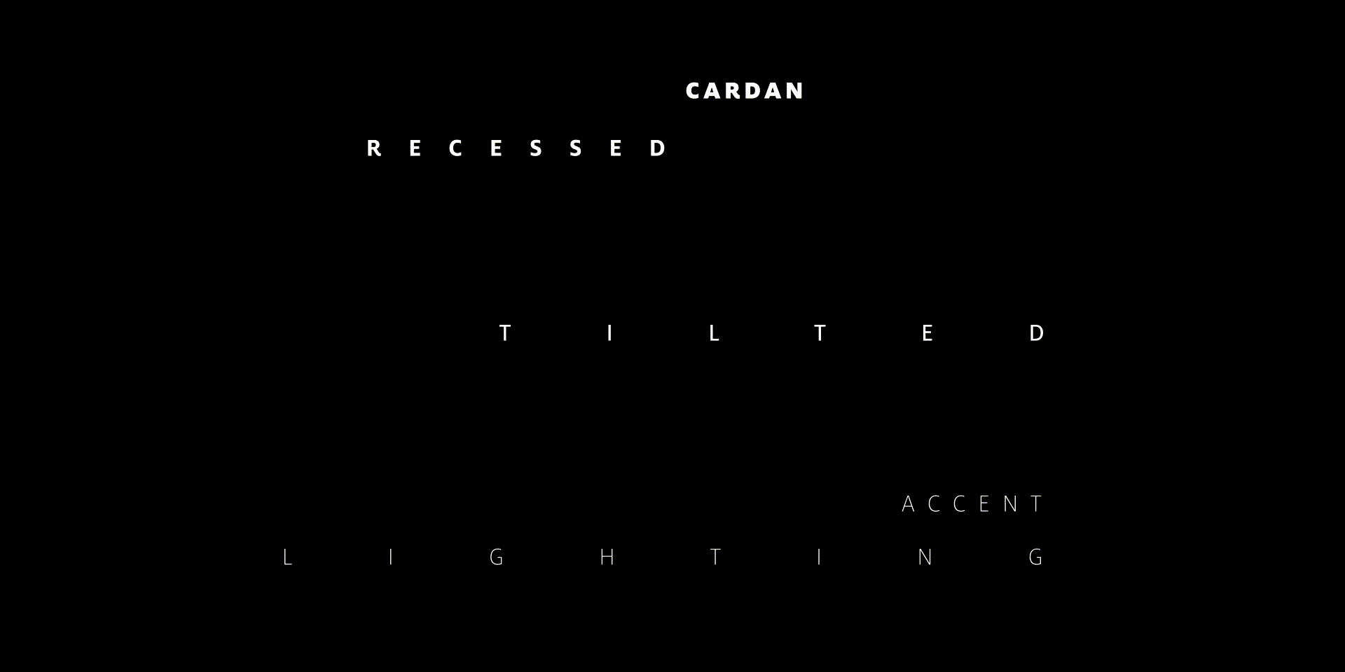
Central to the brand communications is a typographic style that takes its inspiration from the way light particles diffuse through the air, creating a playful system that can shape itself to different lighting effects.

Hight covers
Light for art and culture magazine
z_poetry
Poetry on how light affects us

Instead of industry-typical marketing speak, we turned messaging into poetry that tells evocative stories about what great light feels like and what it enables us to do. A deeper story begins to unfold when the poetry is combined with clean but evocative photography, capturing people’s experiences with light, whether at work or browsing in an art gallery.

z_guidelines-2
The result

In a sector led by glossy product images and generic messaging, Zumtobel once again stands out through playfulness with imagery, typography and language. The brand has found its edge, with a brand thoroughly in line with its tone of voice – graceful, passionate, with a touch of the avant-garde. Updated communications guidelines are now being adopted by the global brand team.

Heading for this popup

Lorem ipsum dolor sit amet, consectetur adipiscing elit, sed do eiusmod tempor incididunt ut labore et dolore magna aliqua.